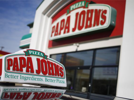
Papa Johns. First the very popular Papa John’s, consumed worldly, this pizza company has customers always coming back for more. The font used is very similar to Aachen bold, which is a slab serif font. It was designed by Colin Brignell in 1969. This typeface features sharp outlines, heavy strokes and stubby serifs. Often used in headlines, posters, signs and other display uses. Along with the enlarged letters in the middle and vibrant red and green colours Papa John’s font is clearly trying to make a statement. It’s bright, loud and has a strong looking font. The red, white and green also connotes it’s an Italian pizzeria as it’s similar to the Italian Flag.
Taco Bell. The Taco bell logo is a growingly popular icon for Mexican food across the UK and USA. With over 7,000 locations in the U.S this fast-food chain is spreading quickly. The Bell in the logo is obviously it’s signature icon, placed on a purple background the clean white bell almost looks like a cut out. The Bell holds homage to the founder Glen Bell. Underneath this is the black nameplate, uniform and bold, in a smart sans-serif typeface with clean traditional contours. The font they used up until 2016 was Corpus Gothic Alternative, quite an expensive font. But it was then replaced to a minimalist sans serif font as the gothic font was outdated. The font has a low contrast and low width but a thick weight to it, making it bold yet simplistic. Even though the Bell features a combination of two shades of purple, light and dark, the wordmark is in plain black. Connoting it’s aimed more toward adults and young adults as it’s less colourful than other fast-food restaurants. The modern typeface and purple colour palette are what separates Taco Bell from other fast-food chains. As it’s less well known in the UK, an American fast-food restaurant that isn’t aimed at families like the other ones might be appealing to more adult consumers.
KFC. The KFC logo is an iconic staple in the curation of other fried food brands. Their Colonel has sat proudly as their logo for more than 60 years, an honour to the originator of the restaurant. As for the typography KFC began with a monochrome handwritten typeface from 1950-1990. But then in the 90s they added their signature bright red to their design and abbreviated their name to KFC from Kentucky fried chicken , giving them a more modern and bold name to fit the times. The latest design of their logo was in 2018, the font chosen was black coloured Friz Quadrata font in italics. The shape of their box logo changed too, to a trapeze shape and the portrait was refined. The red became white and red stripes and the colonel’s face is in black contour rather than the previous blue and yellow. Although in the UK currently most restaurants feature the logo with no stripes and a darker red tone, but with the same font.
Burger King. Burger King have gone back to their old routes. Doing a rebrand this year by going back to their 1970s -1990s logo. Talk about vintage branding! The logo which once featured a blue half circle wrapped around two yellow, bun like, semi circles with the large red Burger King writing, has been trashed. The brand designer for the new look is Lisa Smith. She stated in an interview with Deezen that they are moving toward improving their “quailing and taste” and the old logo needed to be changed in order for the public to have a different perception of them.
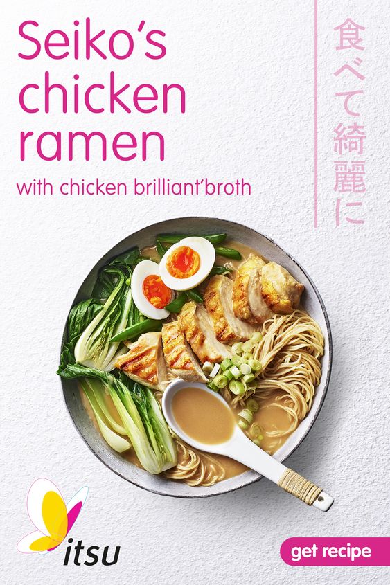
Itsu. Itsu’s logo and typography is minimalist and clean looking. It has bright pink letters on a white background, and a low contrast. The font they used is flux skewed slightly right. In the corner of the first letter there is a small butterfly connoting it’s an all-natural brand. The company consistently keeps the theme of nature throughout their designs emphasising it’s a healthy restaurant. Their products often start out as drawings and sketches made by their founder Julian Metcalfe. Their food containers are modelled on traditional Asian takeaway containers, adopting the font styles, colours patterns and lettering shape. On the website they say their goal is to make their designs and packaging as “easy” as possible to eat from.
McDonalds, the infamous brand that is known worldwide as the dominator of all fast food. The company sells 4,700 burgers a minute and makes around 19.21 billion a year. In this blog we’ll be exploring the typography and branding that goes into every order sold and campaign made.